Wednesday 5 October 2011

In this video clip of 'The Birds' there are many examples of continuity & different types of camera angles/shots. There's not many shots taken though each shot is very effective on the audience due to the great use of continuity.


1 - Establishing Shot 
2 - Mid-shot
3 - Mid-Long shot (tracking)
4 - Low angle mid-shot
5 - Mid-shot
6 - Mid-shot
7 - Close-up
8 - Medium Close-up
9 - Mid-shot
10 - Medium close-up
11 - Close-up (dead male characters feet)
12 - Medium close-up
13 - Long Shot (Point of view shot)
14 - Mid-Shot
15 - Close-up
16 - Medium Close-up
17 - Long shot
18 - Low angle close-up (Female character running towards the camera)

In the very beginning the female character lets her self into the house; during this there's a straight cut from a medium shot to a long medium shot inside of the house. This was great use of continuity due to how smooth it is and the accuracy of the cut is very precise 

The next example of continuity is when the female character walks into the corridor. Once again the cut is very accurate and smooth allowing the flow of the two clips be put together very smoothly.

Another example of continuity occurs when the female character walks into the bedroom; the camera switches from a long shot of her walking down the corridor to a close-up shot of her face. This was done very smoothly and allowed her facial expression to be recognised by the audience.

With all the editing done accurately it allows the video clip to become very smooth giving it a professional feel. The continuity on the match on actions within this clip is done to perfection which is good on the viewers eyes and makes them want to watch more!


Tuesday 27 September 2011

This is my Park High Horror opening. Me and my work group have worked very hard on the camera shots/ angles and final cut pro editing to create this opening. We made sure we included a vast range of shots and angles e.g.
  • Medium shots
  • Long shots (establishing)
  • Close-up shot
  • Extreme close-up shot
  • Low angle
  • Eye level angle
Once we put all the recorded video clips together we did a final edit on final cut pro. I managed to play about with the colour to give it a gloomy black & white feel to it. I did this to match the genre and to bring it out within the opening of my Park High Horror.


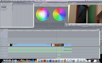
This is a print screen of me editing my 'Park High Horror' intro. In this image it shows the edit of colours. In most of my clips I made sure they're all saturated; I did this to give a gloomy feel to the video allowing it to match the genre 'horror'.


In this print screen it shows me editing the speed of a video clip. I slowed down two clips by 50% allowing it to become slow motion. I did this to add affect to the clips and to build fear within the audience; by slowing it down it creates awareness of the video clip allowing more concentration from the audience in the specific clips.

An example of where I slowed down the clip is at 1:06. This was slowed down to build tension with my character opening the door making the viewers more alert


In this print screen it shows an edit I did known to be a over lapping fade  I put one clip over another so both are played at the same time yet the second clip fades in on top of it. Both clips are still clear to see despite them both being played at once. I did this to add affect on the audience making question 'What was that?' and to make them realise the importance as it only stays on the screen for a short time. This indicates that it's important to the video and needs to be remembered.


I feel me and my group did very well on our work especially with the final cut pro editing. It has taught me a lot about colour changing and adding on small effects that have such a huge impact. I'm going to remember these skills I've learnt and use them in any future recordings we do.


Poster analysis


In this video me and Anujan analysed a movie poster of the film 'Sweeney Todd'. We spoke in detail of what the poster included e.g.
  • Mise en scene
  • Representations
  • Use of colours
  • The character involved
  • Genre
We tried our best to talk about each of the listed above in as much detail as we could; we also managed to do our own private research to learn more about the representations used in this movie poster.

We both should have spoke in a bit more detail about the genre of the movie and what parts of the poster give away that its a specific genre. Apart from this we both went into a decent amount of detail though I'm going to keep this in mind for future reference so that it can be improved next time around.

Brick camera shots


We have watched the first few minutes of the movie 'Brick'. In this opening there where two main characters, one male and one female. the location was in a school and both characters where wearing clothing suitable to the location (school clothing) e.g. shoes, trousers etc. With in the first few minutes we saw two scenes;

  • one in a place which looked like a sewer entrance,the female character was laying on the floor flat on her stomach, dead; with the male character crouched down looking at her in shock with his hands around his mouth.
  • The second scene was in the school with both characters alive, this was done to go back in time to show what happened for both of them to get into that situation.

 - Me and my media group got assigned to reconstruct these events in the movie 'Brick'.

  • We used all kinds of camera angles and distances to try our best to construct what we saw in the movie scenes of Brick. e.g. High angles, low angles, close-up shots, medium shots, overhead shots and more.
  • We also tried to use props to single out our characters, e.g. the female character had a blue bracelet on her left wrist, we used blue earphones to reconstruct it as we never had a blue bracelet at the time. We also used glasses as the male character was wearing a pair throughout the scenes so we did our best to reconstruct this by using a pair of glasses.
  • We could have made this better by being more prepared with costumes and props though we didn't have much time to carry out this assignment so we did fairly well for the short amount of time we had to do it.

Thursday 15 September 2011

First Video


This is my first video I've done for my media blog. In this video it shows me interviewing Anujan on his feelings towards media (film and music).


  • Anujan happily shares his opinions and likings to the audience allowing viewers to learn more about him. He states he enjoys rap music (more on the US side of rap) and is really into comedy films such as The Inbetweeners. 
  • This interview made me question teenagers of the UK and wonder if most have a similar taste in music and genre of movies like Anujans.
  • To make this interview better I feel I should of been more organised by preparing the questions better; as most of the questions asked where thought of on the spot. I should have also been eye level with Anujan instead of above; as a high angle may make viewers feel more powerful then Anujan and this is not what I wanted.
  • Basic editing was used on 'Final Cut Pro' to cut out the bits where Anujan didn't give a clear answer, this made the interview smoother by taking out all the bad bits and only keeping the bits which where good.

Tuesday 13 September 2011

Mise en scene

-This image is a photo that I've taken over my weekend. It's a image of a male all alone in a dark shaded alleyway.

  • I made sure my character is paying no attention to the camera, i did this to make it look natural allowing the audience to have a view of this shaded character in a natural aspect. 
  • I made sure i took this image with a slight low angle to include the scenery above him, of the peaceful trees; yet to capture the dark shaded alleyway that lays beyond my character. 
  • I also tried give this image some sort of  meaning, my message within this photo was to show that every dark beginning has a bright end. With my camera skills I did my best to put this meaning into the image by doing what I felt was right; which was a slight low angle with a long shot. This was done to capture all aspects of the photo taken.

  • In the end of the alleyway lays a bright end, this can symbolise peace. As they say 'every dark tunnel has a bright end' so i did my best to capture this in the photo by showing the peaceful scenery above and the bright exit that lays in the end of this dark shaded alleyway
  • My character has his head down and arms crossed, this suggests he is closed; keeping all emotions kept inside, this helps the audience connect with the character my model is playing and to feel the same pain my character is feeling.
  • My character is wearing a bright red hat, this can represent many things. for example, pain;love & blood. in this situation it would suggest pain as my character is all lone and seems very hopeless in this dark unpleasant alleyway.
  • This image has many positive aspects within it e.g. capturing the meaning within the photo & the clothing my character is wearing; as i feel it reflects the atmosphere around him. Although there are also some negative things that could have been done better. E.g. I could of got a slightly closer and better angle in the image; this could have defined the detail within the photo. I could have also thought about different positions in the tunnel that my character could have been; and thought of one that could have been more affective to my audience. An example of this could be having my character face the camera with his head down in the middle of the tunnel.